Media Room
Hey ya'll.
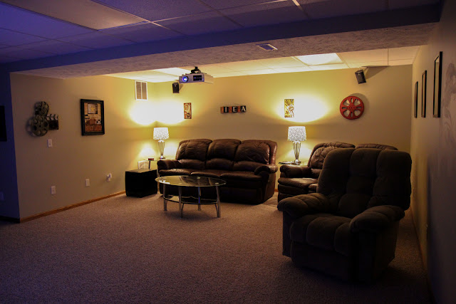
Today, I am bored and incredibly distracted thanks to the insane game we have in store for us tonight, so I thought I would give you a tiny glimpse of our media room.
Back in July, I gave you guys a tour of the basement re-do in our last house.
Of course, you all know [or don't] that we just moved to a new place, so we had to get a new one set up.
The basement in this house doesn't have quite the sizable living room the last one had, but I actually like this one better. The other one seemed a little too spread out, which is not great for acoustics. Plus, we cut down the screen in this one a bit, so being closer to the screen makes it seem that much bigger.
Matt hung the speakers from the ceiling, which as you can see - aren't visible when it's dark in there. Eventually we're going to paint the ceiling tiles black, but that's a project for another day.
I ordered these minimalist posters off of Etsy at Designs by Nick Morrison.
He's a super cool guy who makes pretty legit poster prints.
I kept the movie decor because..well, it's badass. And it only makes sense, eh?
Overall, we're happy with it. Watching KU games down there is crazy cool, as are movies.
Matt just ordered a new sub woofer and we tested it out with the movie Super8. Dexter was terrified.
More house pictures to come, once I actually get around to taking them. Sorry, ya'll. I know I promised them a long time ago, but I'm a procrastinator to the extreme. At least I can admit it. ;)
Fare thee well, kids.


Oh my, your seats look so cozy, and the TV is HUGE! Does this TV have a touch screen feature? I saw an ad from one major TV manufacturer and I was blown away. Anyway, you did a great job in making your media room laid back yet not boring. Have fun in it!
ReplyDeleteAudio video installations in San Diego http://www.hometheatersandiego.com
ReplyDeleteHome theater San Diego
ReplyDelete